Inspiring Young Readers
 posted on 08 Sep 2019
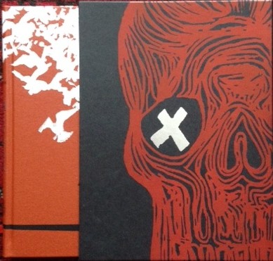
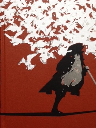
Treasure Island by Robert Louis Stevenson, illustrated by Stirling Hundley
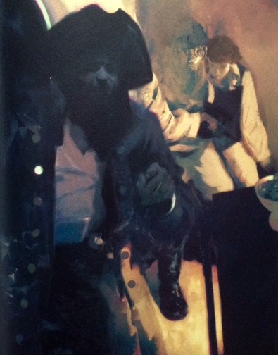
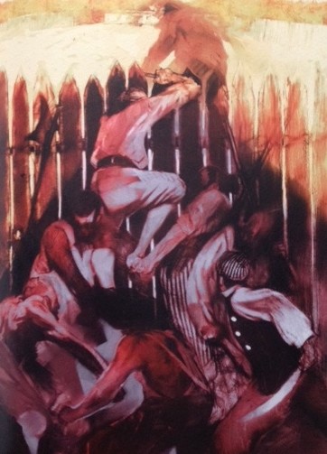
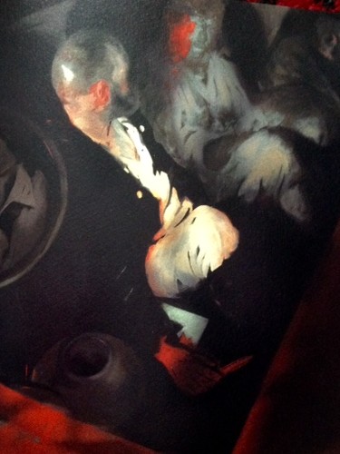
One of the things I most admire about Folio Society books is that they take illustration seriously. By which I mean that they don’t see illustration as merely decorative but as a legitimate, extra dimension to the text. New editions of classics have specially commissioned artwork done for them and the results can be breath-taking. Old favourites can be transformed without compromise being made on what you might call ‘traditional’ values that still put the text before the production - editions like this version of Treasure Island are still primarily Stevenson’s work and not that of Sterling Hundley, the illustrator.
But that’s not to say that Hundley’s work isn’t quintessentially part of the appeal for anyone who decides to buy this book. From the depiction of the ‘black spot’ on the slipcase to the stunning illustration on the cloth cover, there’s a design intelligence at work here that you just have to sit back and admire.
Writing about the commission I was impressed by Hundley’s willingness to acknowledge that his version of Treasure Island has to take its place in a much bigger heritage:
“Know this: the ghost of N. C. Wyeth – the renowned American illustrator whose paintings for Treasure Island count among his masterpieces – haunted and nearly defeated me throughout this project. What hubris to take on this manuscript given the history of the story, the author, and, most directly for me, the penultimate legacy of one of the greatest visual storytellers the world has known.”
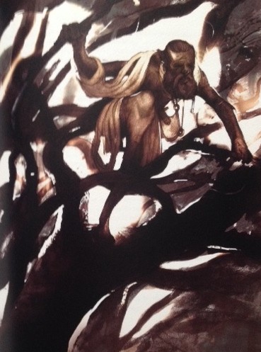
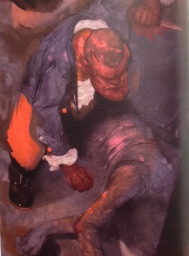
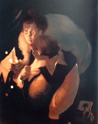
Whatever influence the ghosts of past great illustrators played in Hundley’s work, he’s certainly come up with an outstanding interpretation. The paintings are immediate and sometimes shocking – as the story itself demands. But the task he set himself was, by his own admission, a tough one and in the end it needed a flash of inspiration to solve what could have been a tricky problem:
“My illustrations required a storybook feel, and I knew that paint quality would be a significant concern. My initial paintings, which were 2’ x 3’ wet-into-wet oil paintings on panel, proved to be problematic in scale. They mirrored the attitude of Wyeth’s too closely, without the proficiency. The paintings weren’t without merit, or application, but I put them aside in search of a more contemporary, personal response to the story, to show the relevance of publishing the novel in this modern age. I returned to a drawing-first approach, one that allowed for a more fluid and deliberate stylization.
While the drawings conveyed energy, movement and even violence at times, the strokes of the original paintings created a palatable fluidity and movement of their own. The problem became how to marry the two. I needed a tool that would allow me to combine these disparate approaches into a cohesive visual statement.”
The answer lay in the application of technology and the creation of what he calls ‘digital brushes’. We’re now in technical detail that leaves me well behind but despite that I can appreciate the end result which is, I think, strikingly effective.
So traditional skills meet digital high technology on a subject where the artist has to not just be aware of what preceded him but able in some way to pay a homage of sorts to that heritage. All in all, it’s a triumph and it’s also the Folio Society doing what it does best – bringing together familiar stories and novels and breathing new life into them.
You should expect to pay £30+ for a copy of this and you might think that is expensive but I would beg to differ. Books like this are the most affordable, genuine works of art I’m likely to be able to buy on anything like a regular basis – I think we should recognise them as such and be delighted the people at Folio are currently making such great commissioning decisions.
Terry Potter
September 2019
(Click on any image below to view them in a slide-show format)