Inspiring Older Readers
 posted on 18 Sep 2018
Classic Covers: The Grapes of Wrath
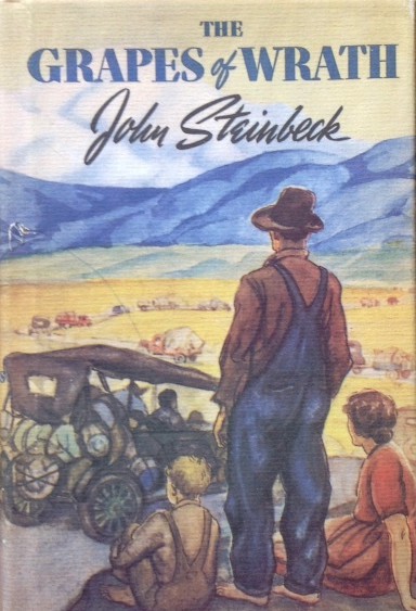
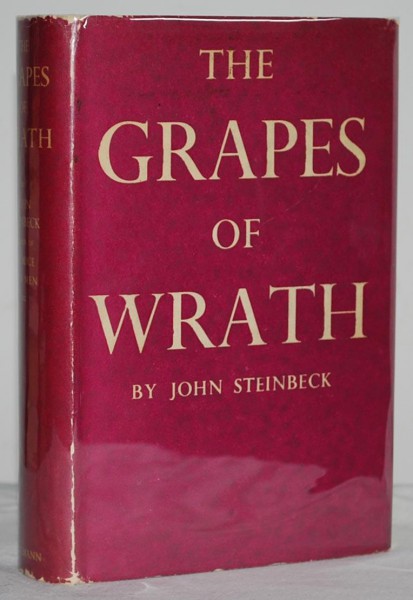
The dust jacket produced for John Steinbeck’s 1939 classic, The Grapes of Wrath is one of those that can claim to be almost as admired as the book itself. Some jacket designers will try and capture the spirit of a book by symbol or suggestion or by providing the reader with an abstracted design possibly based on an incident in the novel. Others will go graphic – dodging the problem of what image to select by relying on typeface, fonts and design sensibility to carry them through.
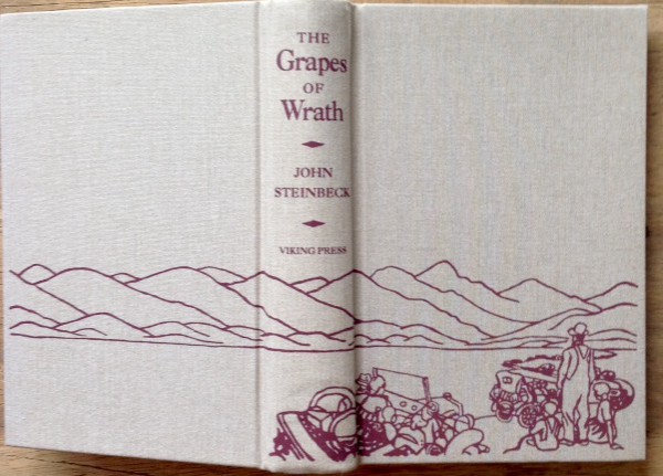
Elmer Hader who was commissioned to do this jacket chose another route – social realism. And while the jacket looks as if it should always have had the image it carries, the decision to go with this tableau of the Joad family looking out over the dustbowl landscape they will have to traverse on their journey to California is a masterstroke of inspiration.
Hader (1890 – 1976) is probably better known for the work he did illustrating children’s books with his wife Berta. Together they illustrated over 70 books and won the Caldecott medal in 1948 for The Big Snow – a picture book that shows how animals prepare for the harsh American winters.
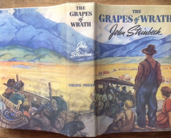
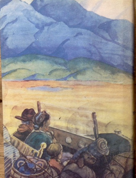
I always love a complete wrap-around jacket and to appreciate the illustration on The Grapes of Wrath at it’s best you need to fold it right out and have a look at the composition. What makes up the front panel shows the Joad family looking across a plain where a trail of other migrants from the mid-West dust bowl are also making their way to the distant blue mountains and on to the west coast. The representation of the characters – the way they stand or sit and the clothes they wear – is reminiscent of the photographs taken by Walker Evans to illustrate that other great classic by James Agee, Let us Now Praise Famous Men, which also talked movingly about the plight of the dust-bowl farmers. Significantly though, in Hader’s illustration all the figures look away from us into the distance – none of them meet our eyes. The degradation and shame of the trail they are forced to travel is captured by that single decision.
The spine of the jacket carries the title, the authors name and the publishers name but all in different fonts against an essentially featureless landscape without human figures. The back panel brings in the next small truck in the convoy with the sparse belongings rolled and tied onto the sides of the vehicle. The desperation of journey is tangible.
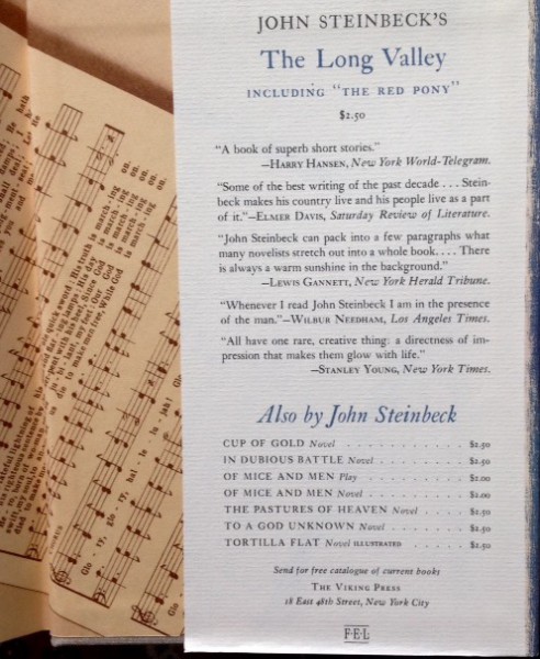
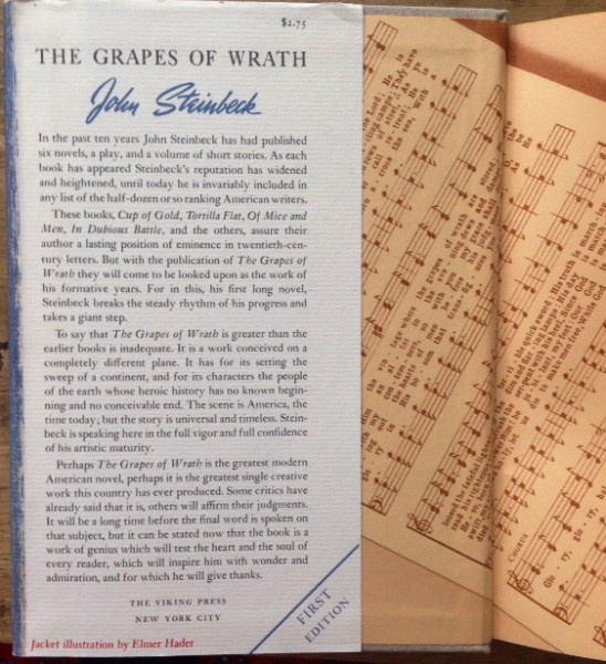
The front inside flap carries the blub about Steinbeck and the book while the back inside flap has advertisements for other Steinbeck publications.
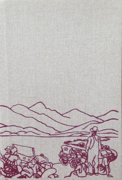
Take off the jacket and you'll find fawn cloth boards with a sketchy outline line drawing that can only hint at the richness of the actual cover drawing.
The power and value of the dust jacket is perhaps best illustrated by the impact of its absence has on the value of the first edition. You can expect to pay several thousand pounds for a first edition with a good dust jacket but you’ll pick up a first edition without a dust jacket for several hundred pounds.
Incidentally, this classic jacket graces the US first edition but not the UK’s version which was published by Heinemann in 1939. For reasons it’s hard to explain, they’ve gone instead for the most tedious alternative they could think up - something completely plain in a shade of purple ( what’s that colour called? Magenta?) .
I know which one I want. Sadly, my copy is just a facsimile but a very faithful and good one all the same.
Terry Potter
September 2018
(Click on any image below to view them in a slide show format)