Inspiring Older Readers
 posted on 18 Apr 2018
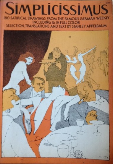
Simplicissimus: 180 satirical drawings from the famous German weekly with text and translations by Stanley Appelbaum
Established in Germany in 1896, Simplicissimus was in many ways the prototype for the modern day satirical magazine. Although it continued publishing right through until 1967, it is really the commentary it sustained on the preposterous pomposity of the German military immediately before and after the First World War and its portrayal of the Weimar years that stand out as most creative, original and barbed.
Simplicissimus made itself the home of a number of writers who would go on to build an international reputation – Thomas Mann, Herman Hesse, Rainer Maria Rilke and Erich Kästner to name a mere handful. Nothing was off-limits for the magazine if its editors felt that ridicule had been earned and so it’s not really surprising that the authorities at various times tried to repress the paper and imprisoned its staff. It was only at the end of Second World War and the effective occupation of Germany by the Allies that finally forced the paper into suspension for the best part of ten years, resuming its work again in 1954.
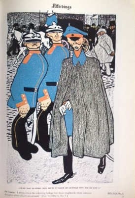
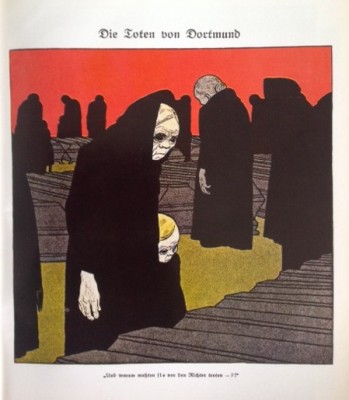
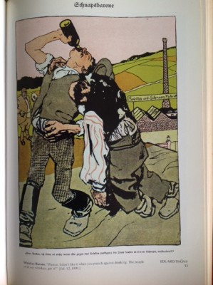
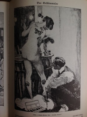
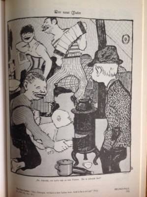
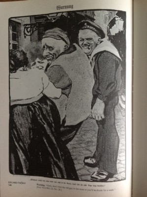
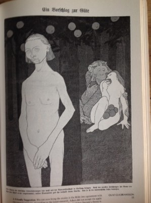
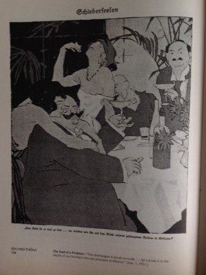
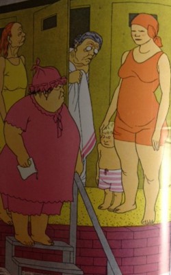
As well as daring contributions from authors, the paper became famous for its satirical cartooning and it is this artwork that Appelbaum’s book focuses on. He’s selected 180 examples of drawings, colour and black and white, that he sees as representative of its greatest moments.
The book is organised around the artists who appear in alphabetical order and before we get to the plates Appelbaum gives us a pen portrait of all the contributors – some of who will be better known to the British reader than others. There are selections here from George Grosz, Thomas Heine and Alfred Kubin and plenty of others who were entirely new to me.
The variety of styles is startling but I was also struck by how, even when the artist comes at a topic from a very different perspective, they all share a common sensibility that is a mix of disgust, outrage and bewilderment which can only be expressed with a sort of knowing or sometimes bitter ridicule. I’m immediately struck by just how different this feels to its most immediate British equivalent, Punch Magazine, which always felt much more gentle and moderated and interested in folly rather than wickedness. Somehow Punch always felt like the establishment joshing with itself in a sort of irritatingly knowing way. They could have learned something from Simplicissimus. I would suggest that it’s probably artists like Scarfe, Steadman, Bell and Rowson who are the modern British inheritors of the Simplicissimus tradition and their fearlessness wouldn’t have been out of place in the pages of the magazine.
This edition is the 1975 Dover Art publication. I just love these Dover Art books because they are big and generous and were, at the time, a wholly accessible way of get your hands on art books that weren’t too expensive but were very well produced. Their card covers are a bit notorious for curling but that’s a small price to pay for a soft-cover book that is actually sown on its spine. I love the fact that on the back of all Dover publications they carried the promise:
"Our paper is opaque, with minimal show-through; it will not discolour or become brittle with age. Pages are sewn in signatures, in the method traditionally used for the best books, and will not drop out, as often happens with paperbacks held together with glue. Books open flat for easy reference. The binding will not crack or split. This is a permanent book."
Wonderful. And true of all the Dover books I own.
And here’s some even better news. You can get a copy of this book for under £10 from second hand dealers advertising on the internet.
Terry Potter
April 2018
( Click on any image below to view them in slide show format )