Inspiring Older Readers
 posted on 15 Dec 2017
Life and Punctuation…? by User Design
I rather liked the overall design of these two rather unusual, slim books – there was something in their clean lines and brevity that appealed to me. For me, judging a book’s aesthetic appeal is an important part of its overall impact, but I was intrigued to learn from the author’s website* that he is much more ambivalent. It would seem that the company responsible for producing these books sees utility and access to the information as more important than the way something looks:
‘Essentially information design is more content, complexity and usability concerned than just about concerns of aesthetics. It also commonly includes: making communication easier to understand, legibility, research and user testing’.
Hence, presumably, the very basic format and presentation of these two little books.
Let’s take a closer look at each of them with this in mind; although on refection, I am not entirely sure what ‘research and user testing’ mean, but I imagine that it’s about whether the implied reader understands the overall function of the book and then uses it?
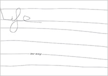
Life is described as ‘a pure picture led book (no text) story about one day in the life of somebody’. All drawn clearly in black with a consistent width of line, it begins with a picture of the central character framed in the doorway of a building, perhaps on his way to the car in the foreground. By the next page he is pitched into the chaos of the traffic and it is difficult to identify him amongst the hectic busyness of it all - but perhaps he isn’t there after all and he’s merely looking out from his doorway as on the next pages we see a line of cyclists stretching across the page from left to right .
This is the beauty of the wordless book because so much is in the eye of the beholder.
Then the perspective dramatically changes and we are given a bird’s eye view that shows him walking along one of the many roads carrying his bag. Where can he be going?
Next there appear to be some windows, or possibly posters and he marches on by. Is he waiting outside the door of what looks like a restaurant on the following pages, or is he looking in the window? By the next page we can see a little more detail on his face and he doesn’t look a very happy fellow at all.
And so his rather ordinary day continues with nothing particularly remarkable happening but plenty of detail to dwell on and interpret. It is this blend of complexity with a very naïve style that makes this story so compelling.
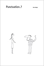
The cover of Punctuation…? shows us two people, one of whom is holding his head in what seems like confusion and so signals from the outset that whatever we mean by the ‘correct’ use of punctuation might be a contentious issue.
In the subsequent pages we are treated to some graphic representations of various punctuation marks with quite a lot of text beneath to further explain when these might be used. Exceptions to various punctuation rules are also included and if nothing else this book reminded me about the grammatical irregularity of the English language when compared to some other languages. Once again, the illustrations are concise and witty in design all of which convey an overall joy in this complexity.
In terms of effective communication about a specific subject, I think that this book has a good go at itemising and illustrating the various uses of punctuation – so in that sense its utilitarian function has been satisfied.
I would imagine that there are plenty of people out there who care enough about punctuation and its rules who would love to get a book like this – after all Lynne Truss made a fortune out of showing us that grammatical precision isn’t just a minority sport.
Karen Argent
December 2017
https://www.userdesignillustrationandtypesetting.com/books/