Inspiring Older Readers
 posted on 13 Sep 2017
A new edition of The Handmaid’s Tale by Margaret Atwood
I have written before about the way that I think that the publishing industry has responded to the digital threat by really substantially upping its game and producing paper bound books of the most exquisite quality. We are, I’m convinced, in a golden age of book design. You can buy what are effectively little works of art for under £20 and they not only enhance your aesthetic senses they make the whole reading experience that little bit more special.
This week I came across a concrete example of this when I was browsing in my local Waterstones. A new edition of Margaret Atwood’s The Handmaid’s Tale has been released in hardback by Vintage – presumably to coincide with the television adaptation - and it’s a truly marvellous thing.
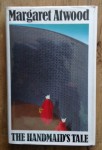
I thought that it might be a tough ask to better my 1986 Cape first edition of the book with its evocative jacket illustration by Fred Marcellino. It captures the books dystopic oppressive content with its arching wall of grey brick towering over two stylised Handmaid figures walking the perimeter and travelling in opposite directions. The vivid red of their gowns and white of the bonnets picked out against the monochrome grey. Fabulous.
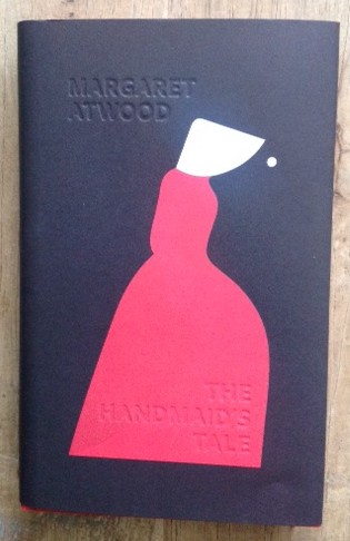
But the new Vintage edition takes design to yet another level and incorporates the whole book. Suzanne Dean has done the overall design but you’ll be captured in the first instance by Noma Bar’s startling illustration. Against a charcoal black background is a single stylised profile portrait of a Handmaid with sculptural red gown and triangular bonnet. This figure then appears on the reverse but this time smaller and forward facing, creating the shape of a keyhole and showing a face in half profile topped with the bonnet. Beneath the back cover illustration are the words Nolitete Bastardes Carborundorum (Margaret Atwood’s piece of cod-Latin from her school days which she claims can be translated as ‘Don’t Let The Bastards Grind You Down’ ).

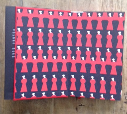
She has also provided the same back cover motif for the inside front and back cover and free front and end papers – here we see a Warholesque multiplication of the image – and the page block top and bottom is a rich red stain.

The title and author on the spine is traditionally printed – author in red and title in white – but on the front cover they are impressed into the paper itself and only picked out by the outline of the imprint. It creates a sumptuous feel to the front jacket and you’ll want to run your fingers over the jacket just for the pleasure of the sensation.
At £14.99 this little piece of heaven is a steal – a great book housed in a masterpiece of book design.
Terry Potter
September 2017